Studs
CLIENT: STUDS
DETAILS: INTERIOR DESIGN + VISUAL MERCHANDISING DESIGN LOCATION: NOLITA, NYC
PHOTOGRAPHY: Provided by Client
STYLING: HUXHUX Design Inc.
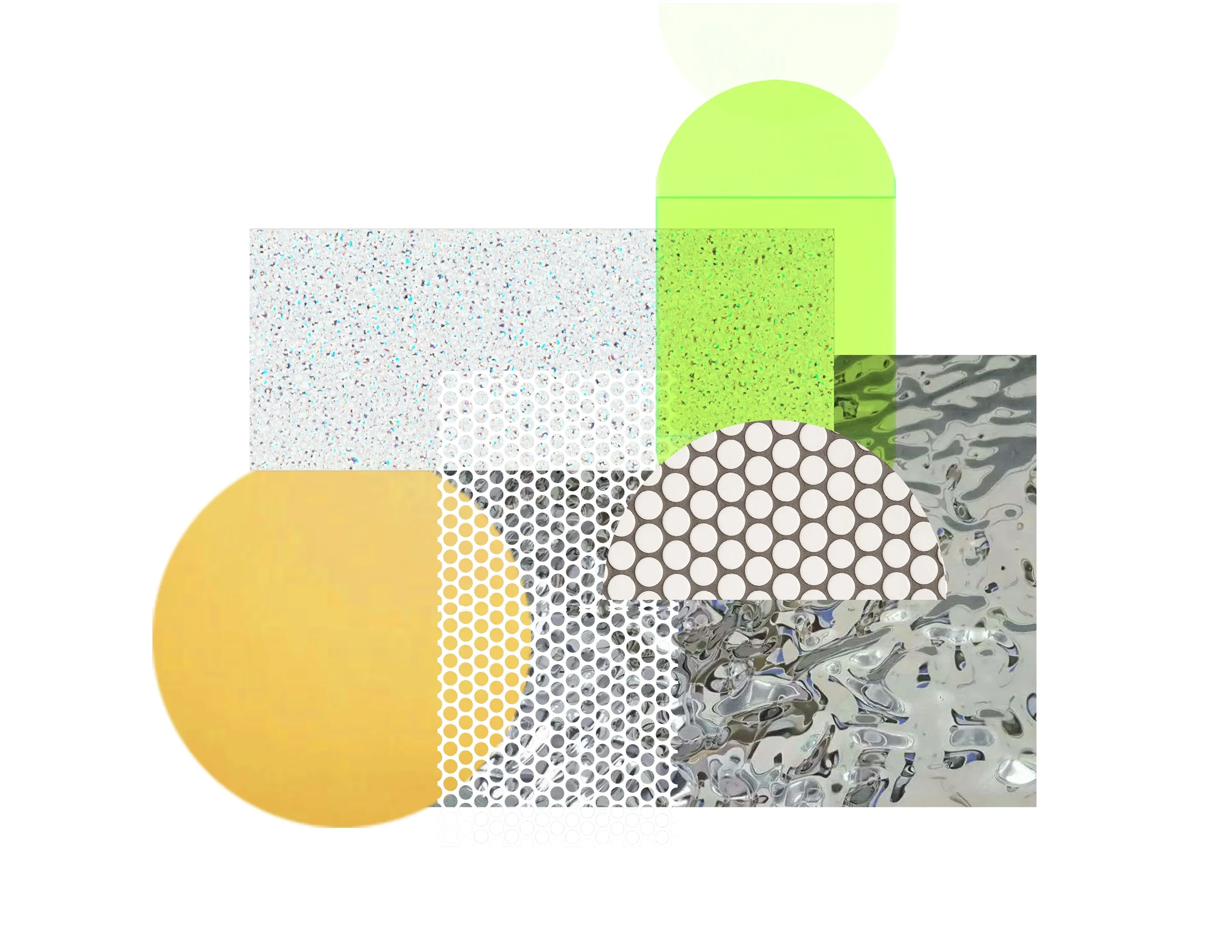
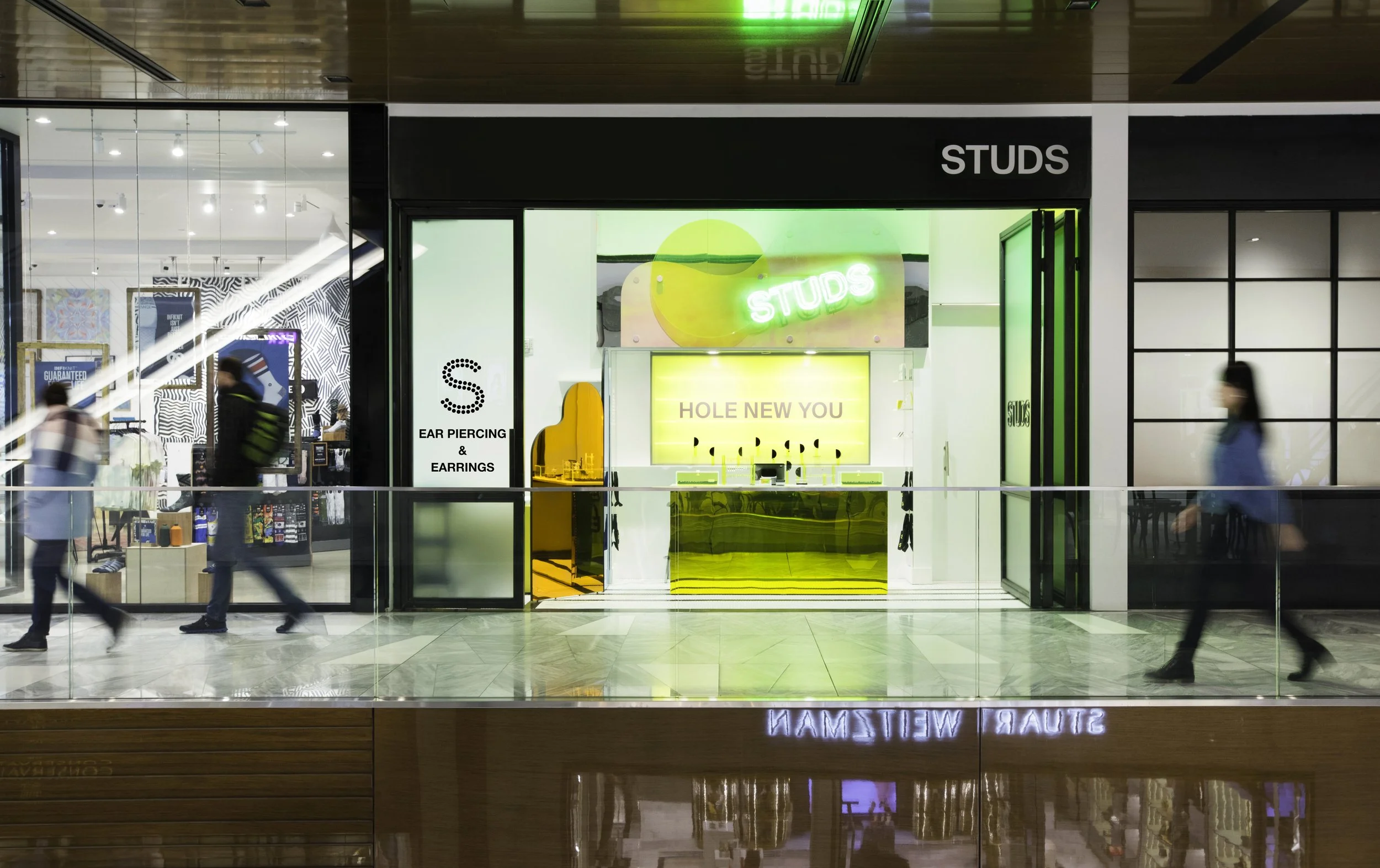
HUXHUX Design Inc. served as lead Interior Designer for the first ever Studs store. The client engaged consultants like Tom Hancocks and Office Ben Ganz to help find their brand voice. As Studs’ designer we brought that voice to life through the 12 Prince space. From the very start we were in love with the brand concept. For our team it was a fresh and interesting challenge to design a seamless transition from shopping to consultation to service. We embraced juxtaposition immediately. We began by investigating geometries of piercing-- soft organic ears versus hard clean forms of piercing. This allowed us to operate in our wheelhouse of shape play. We quickly came to consider the Studs space as one of playful discovery with close attention to the minute details of something as small as a piercing stud.
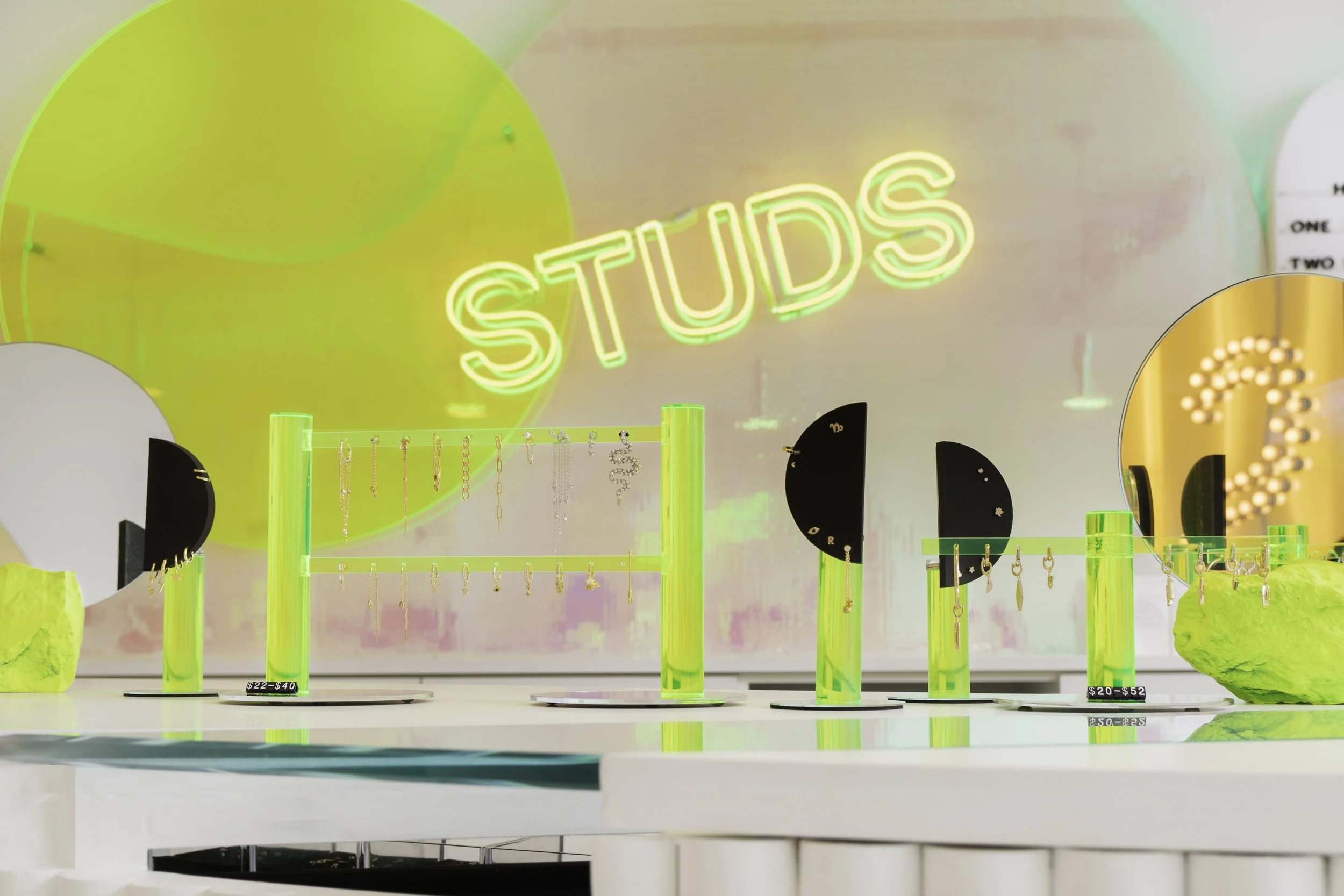
Our design concept for this store was to build a perfect clean white box that comes to life with colored light and dynamic surfaces. Because the scale of Studs product is so tiny we wanted to design a wall where you can take in all of the studs in a gallery setting. The forms for the gallery wall are odd yet familiar. They are organic yet derived from a clean geometry. They spark an anthropomorphic recognition and beg for self reflection as colored light bathes the walls at their edges and the mirrored surfaces reflect ones presence in the space.
We designed the Ear Bar as the focal point of the store. From the moment you walk into the store your attention immediately goes to two shaped vitrines in the counter. One is an organic lobe-shaped display case for fashion jewelry. The other is a clean linear case that literally pierces the counter top. This contains all of the studs specifically intended for piercing. Here the customer can interact with all of the visual merchandising tools which HUXHUX Design Inc. also designed and fabricated. These include preset earscape forms which present a preset of ear piercings on an ear form made of black foam, neon acrylic and mirror. Typical earring displays were ditched as we opted to design sculptural neon acrylic objects upon which Studs merchandise is presented.
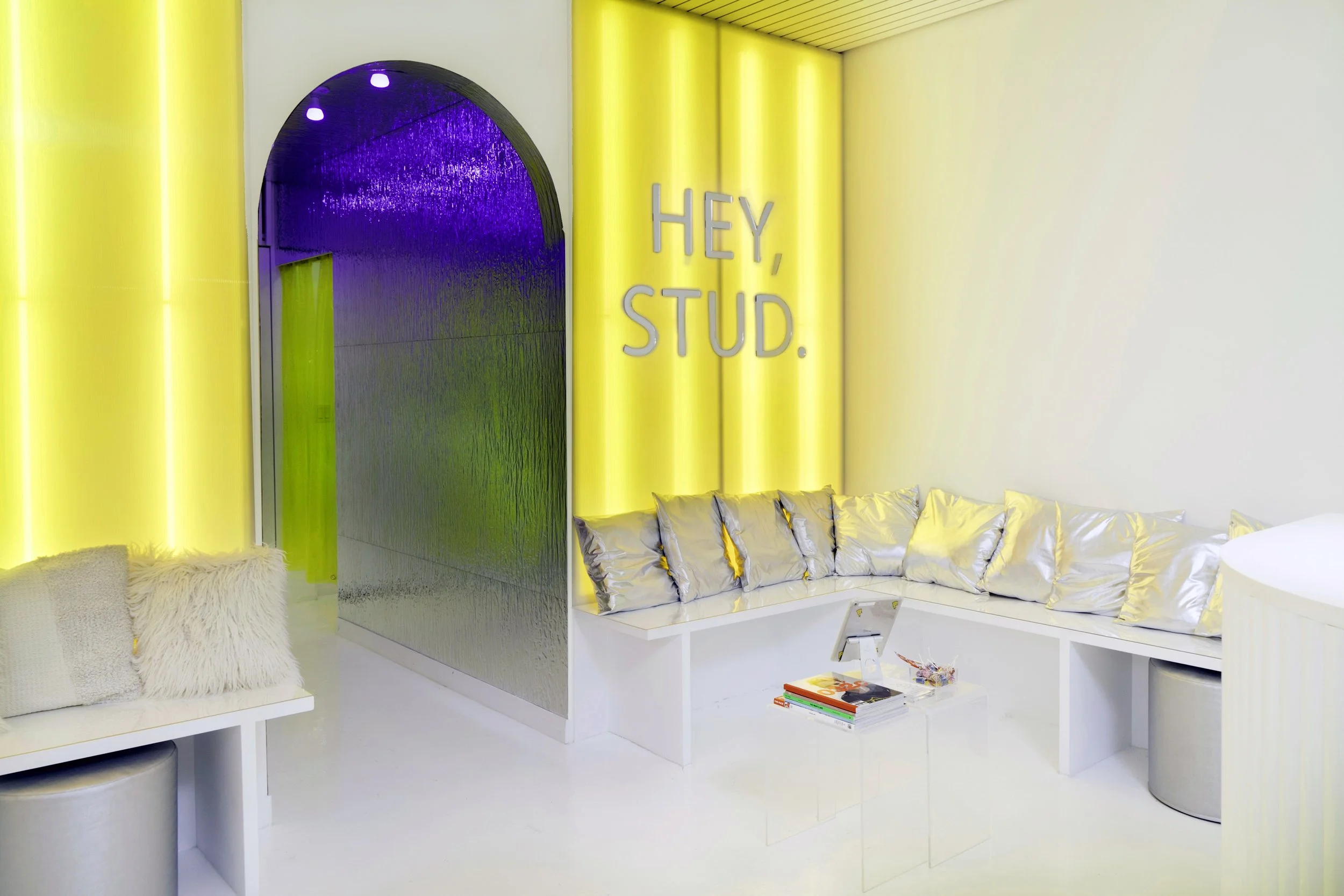
As customers consult on piercing options and decide to take the plunge for a piercing they must transition from retail to clinic. Forms need to be completed and further consultation ensues. To that end we designed a lounge at the rear of the sales floor which also serves as a space to socialize and relax. We wanted this space to glow with the Studs brand yellow so we designed a custom illuminated wall that bathes the rear of the store in a vivid yellow glow. As customers wait they can also interact with the reflective “S” vanity wall, yet another opportunity to capture the moment of their impending transformation.
A reflective mirrored hallway draws customers back into the treatment rooms. The walls are paneled with mirrors that ripple like water. We designed this corridor as a cool transitional space...a processional moment in the piercing process. We conceived of the treatment rooms as cool, clean, bright white spaces that feel clinical and futuristic devoid of any light play that characterize the other spaces.
THE PROCESS


