Bulletin Soho
CLIENT: BULLETIN
DATE: 2017
DETAILS: INTERIOR DESIGN
PHOTOGRAPHY: Sean Litchfield
STYLING: HUXHUX Design Inc.
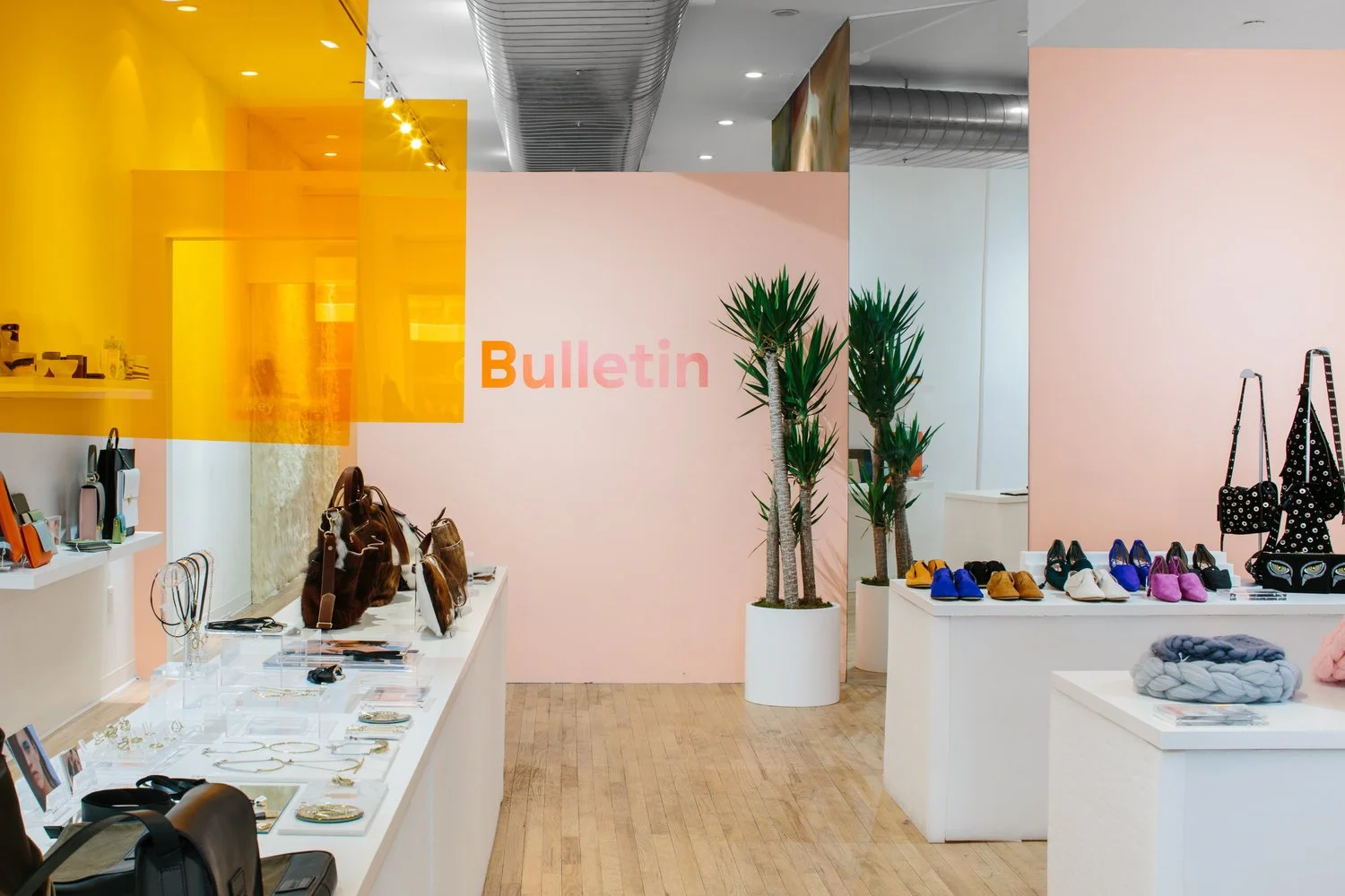
We wanted the physical spaces to embody the brand. Bulletin is all about taking online brands offline. It consolidates through curation. So the store design became focused on a central merchandise spine that brings together all sorts of independent designers at this monolithic table. For this table we chose to use white foam to construct the monolithic volume. The foam for us represented something that is typically fleeting in a retail transaction. It also has a tactile quality that piques people's curiosity as they interact with it in the retail space. We wanted to draw people in and urge them to touch and interact with the store itself.
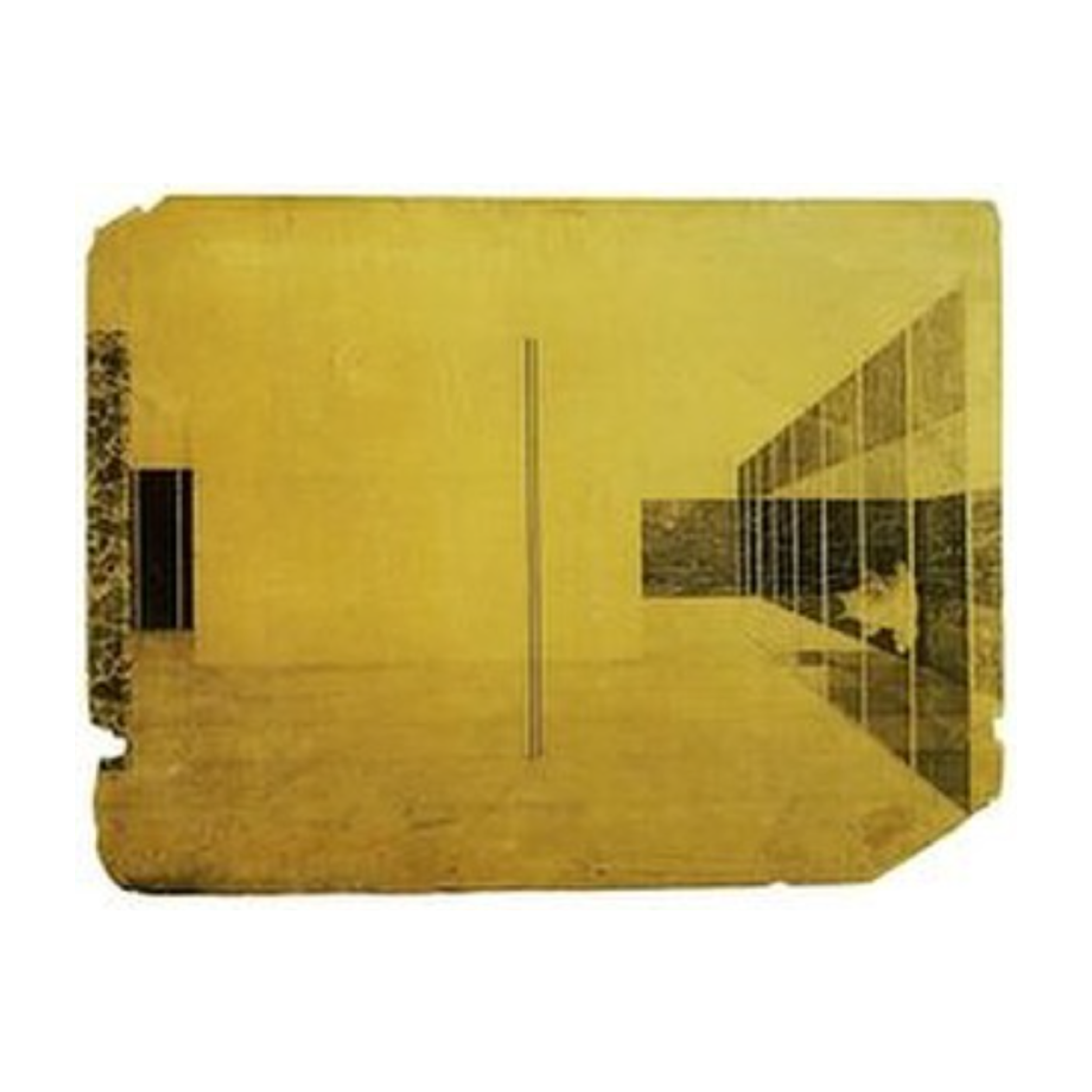
Hanging above the central spine we have a Miesian moment of planes in space. The orange acrylic is a nod to the Bulletin brand while also helping to provide legibility about the brand concept to shoppers. Each acrylic plane demarcates the specific vendors.
In addition to consolidating designers, the store also brings together people by inviting them to lounge at the back of the store. This provides vendors the opportunity to use the store as a hub for connecting with customers. Another deliberate material palette choice was made with this space in mind. We designed a giant faux fur wall and made this space relentlessly beige. The fur again sparks human interaction in the space, whether it's posing for photos in front of the unusual situation or just petting the faux fur as you lounge with vendors and friends.
We worked with Wallpaper Projects on a custom mural wall which riffs off of the faux materiality concept that was set in motion with the fur wall in the lounge. The "marble" wall anchors the center of the shop and situates the clothing portion of their vendors.
